
I must apologize for no posts this week , I have been terribly sick and just starting to feel a little more normal the last two days.
A few years ago when I was taking courses for Interior Decorating at College (my daughter was in high school at the time and would laugh every time she told her friends her mom was in College) one of the courses I enjoyed very much and learned quite a bit from was Colour Theory. One of the most important things I learned to identify was "undertones". Undertones are just that, the tones underneath the colour that you see.
I will give you an example:
Yellow Based Neutrals

Red Based Neutrals

Visually you can see the differences right away. But take it to another level. Imagine you have a yellow based neutral on your floor. You have a beige carpet that has yellow undertones or a wood floor with yellow undertones, a beautiful honey oak. What do you think would happen if you put a neutral beige on the walls with a red undertone? Well, I will tell you. The walls would look pinker and the floor would look yellower causing a clash.
Many people mistake grey for green if there's a green undertone, or plum if the undertone is purple. To determine the undertone in a grey paint you are considering, compare it to a "true" grey paint chip, which has no colour. A true grey paint chip would be a combination of black and white.
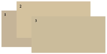
 Say this is the beige you choose. In order to get a better idea loo at the next picture.
Sample number 2 is more yellow and number 3 has a bit of a green undertone. I hope you can see it. Sometimes its hard to see the colour on a computer screen.
These are all beiges but you can see they have differences when compared.
Check out these beautiful neutral rooms.


A few years ago when I was taking courses for Interior Decorating at College (my daughter was in high school at the time and would laugh every time she told her friends her mom was in College) one of the courses I enjoyed very much and learned quite a bit from was Colour Theory. One of the most important things I learned to identify was "undertones". Undertones are just that, the tones underneath the colour that you see.
I will give you an example:
Yellow Based Neutrals
Red Based Neutrals
Visually you can see the differences right away. But take it to another level. Imagine you have a yellow based neutral on your floor. You have a beige carpet that has yellow undertones or a wood floor with yellow undertones, a beautiful honey oak. What do you think would happen if you put a neutral beige on the walls with a red undertone? Well, I will tell you. The walls would look pinker and the floor would look yellower causing a clash.
Many people mistake grey for green if there's a green undertone, or plum if the undertone is purple. To determine the undertone in a grey paint you are considering, compare it to a "true" grey paint chip, which has no colour. A true grey paint chip would be a combination of black and white.
Say this is the beige you choose. In order to get a better idea loo at the next picture.Sample number 2 is more yellow and number 3 has a bit of a green undertone. I hope you can see it. Sometimes its hard to see the colour on a computer screen.
These are all beiges but you can see they have differences when compared.
Check out these beautiful neutral rooms.

Any of these neutral rooms can have a punch of colour added at any time.
thanks for posting this... i'm just now realizing all of these differences and the way things harmonize in decor... which is sad considering I too had a color theory class in an art school and wasn't taught such a thing :( Hope you feel better soon!
ReplyDeleteI'm so glad you found it useful and thank you for the well wishes , I almost feel a little normal today!!
ReplyDeleteThese are great tips for anyone decorating, painting, crafting or dressing! The rooms pictured have a good variation in values and texture so are still really attractive. Thanks for sharing you knowledge. Glad you're nearly back to a healthy state!
ReplyDeleteGreat post, I color comics and we use color theory daily. It's really useful for any artist.
ReplyDeleteI'm a new follower. You can find me at http://repurposehistory.blogspot.com/
I had a similar experience as it related to alder wood cabinets. I saw them in a home where they had a pink cast to the wood. I wanted alder but I didn't want a pink shade to them. It was because the wall color pulled that shade out of the wood. In my home I used a muted light gold on the wall and the alder does not cast a pink shade. So it was a real lesson in how wood tones can also be affected by "neutral" color that really isn't so neutral.
ReplyDelete